

How to Choose Curtain Colour
Why the swatch in your hand is already lying to you, and the four checks that stop a colour going wrong.
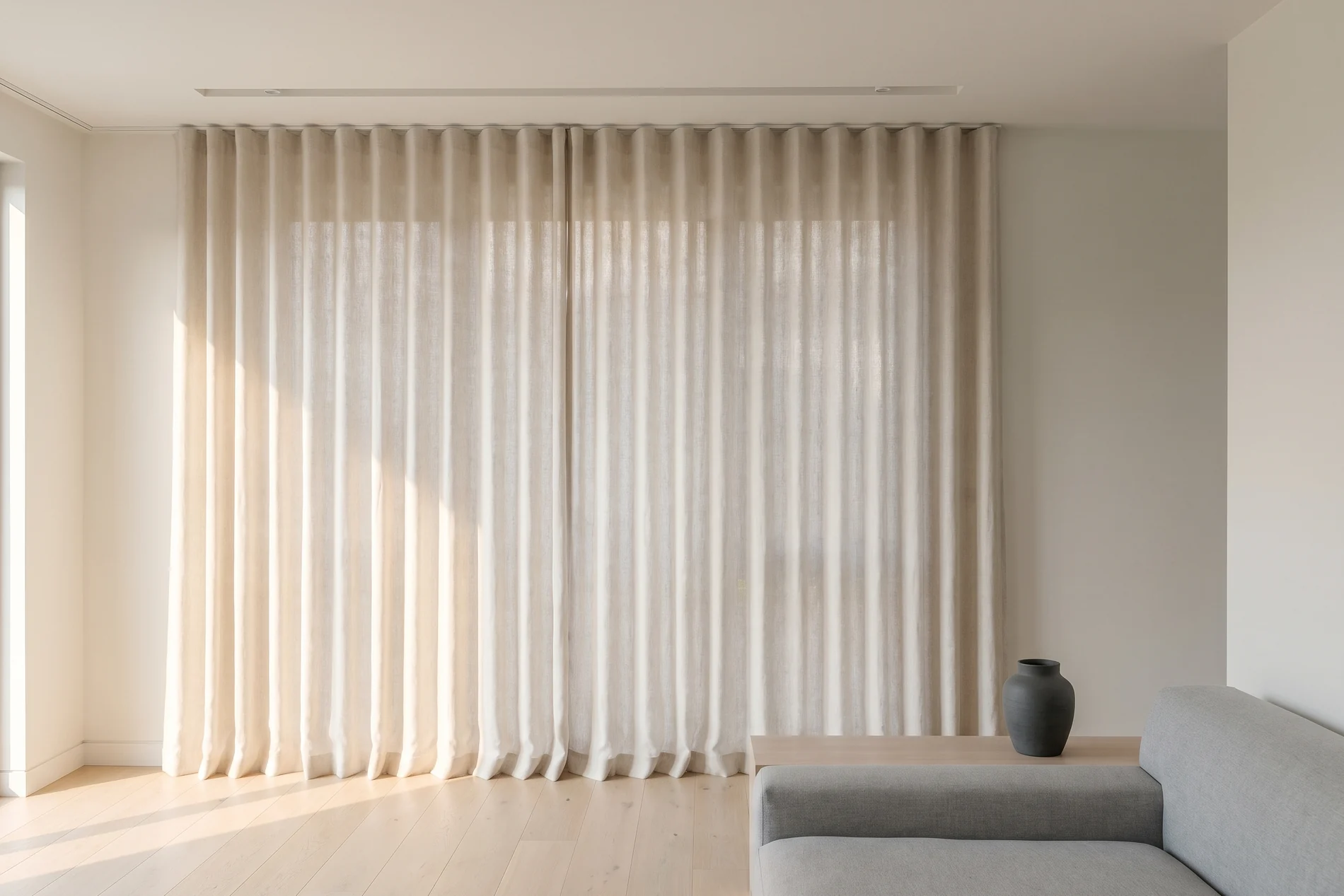
How to choose curtain colour: start with the light the room actually gets, take your undertone from the things you cannot change — floor, joinery, wall paint — then move two or three shades away from them rather than matching exactly. Test the sample hanging, at the window, at the hour you use the room.
Forced to pick one colour sight unseen: a warm off-white, half a shade deeper than the wall.
Almost every guide to curtain colour was written for the northern hemisphere, where a north-facing window is the cold, dim one. Here it is the bright one, all day, all year. That single inversion undoes most of the room-by-room advice on the first page of results — and it is not the only thing those articles leave out.
Start with the light, not the colour wheel
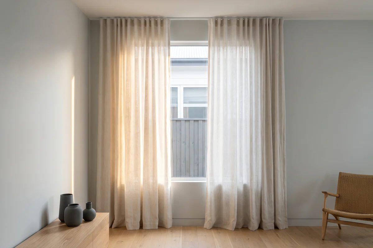
Work out which way the window faces before you look at a single sample. In Australia a north-facing window takes sun most of the day and throws a warm, yellow-leaning light into the room. A south-facing one gets almost no direct sun and gives you a cool, even light that barely changes all day. East is hard and bright until about eleven. West is the difficult one, and we will come back to it.
Light carries colour into the fabric. The same oatmeal linen reads creamy and soft on a north window, faintly grey and cold on a south one. Neither is the fabric's fault. Choose a colour in a showroom for a south-facing bedroom and you have chosen it under the wrong light — and showroom lighting is designed to sell fabric. It is very good at its job.
So take the sample home and look at it against the actual window, at the hour you use that room. A colour assessed once, at 10am on a Saturday, has not really been assessed.
Why white is never white
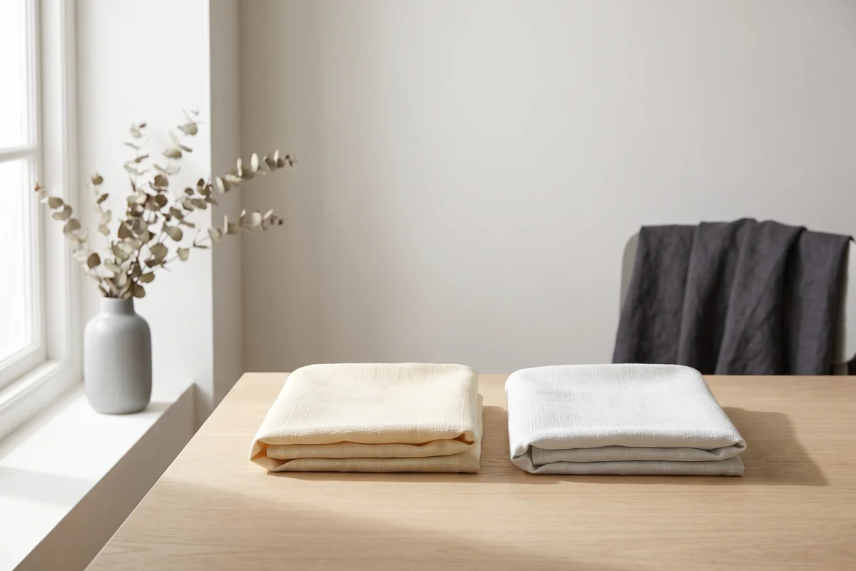
White is a category, not a colour. Every white fabric leans one way or the other: warm whites run through cream, bone, oatmeal and greige; cool whites through chalk, snow and the greys. Put a cool white against a warm white and one of them instantly looks dirty. That is not a quality problem but an undertone mismatch, and it is the most common way a white curtain goes wrong.
Most Australian homes are painted a warm off-white, so a cool blue-white curtain against one makes the wall look yellow and tired. Reverse it and the curtain looks grubby. Get the undertone right and you can be as far apart in depth as you like — a deep warm stone against a warm white wall is a genuinely good scheme.
The test takes ten seconds: hold the sample flat against the wall in daylight. If one of them suddenly looks slightly soiled, you have your answer. There is no neutral white — only a white whose undertone you have not noticed yet.
The swatch is flat. Your curtain will not be
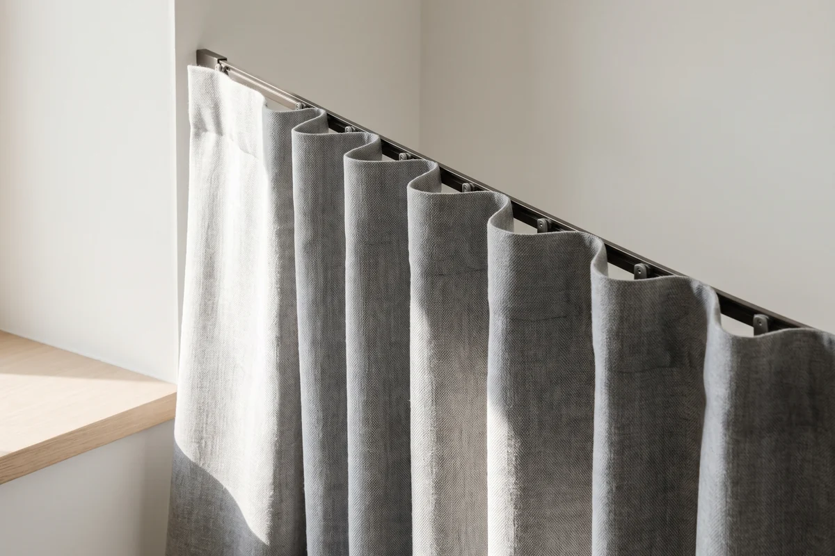
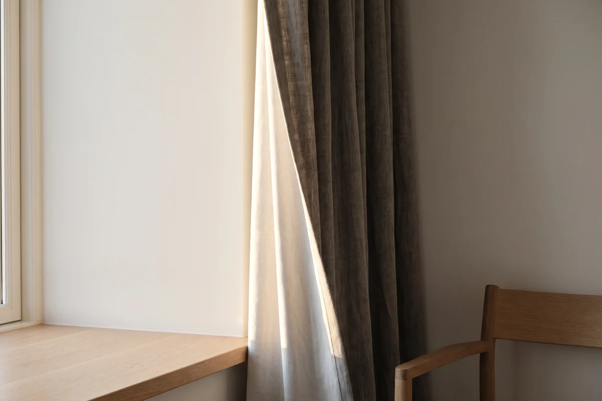
This is the one nobody tells you, and it is the reason so many curtains arrive looking darker than the sample. Made-to-measure curtains are cut at roughly twice the width of the opening, sometimes more, so the fabric is folded the whole way across. Every fold carries a shadow down its inside face. Hung, the colour reads deeper and more saturated than the flat swatch in your hand — call it a couple of shades, and more than that in a heavier weave.
Pale colours survive this comfortably. Mid-tones are where it bites: a mid-grey or a soft sage that looked calm on the swatch can hang muddy and heavy. Choose a red because it looked rich flat and you have ordered something richer.
The heading you choose changes it too: an S-fold's even wave reads uniform down the whole drop, where a pinch pleat breaks the light across the top and softens lower down. A decorative track changes what happens above the fabric again.
The fix is free: gather the sample into three or four folds instead of holding it flat. That is much closer to what you are buying.
What the Australian sun does to colour
Colour fades because ultraviolet light breaks down dye, and this country supplies a great deal of ultraviolet light. Brisbane sits at 27°S. The Australian Government's Your Home guide puts the load in terms anyone can picture: direct sun can generate the same heat as a single bar radiator over each square metre of surface, and effective shading blocks up to 90% of it. Check what the UV index actually does where you live on ARPANSA's charts; it is usually worse than people assume.
Dark fabrics absorb more of that radiant heat, so a charcoal curtain on a west window is warmer to stand beside than a cream one. And fade never arrives evenly — it shows first on the leading edge and down each fold that faced the glass, which is exactly where the eye goes.
No fabric is fade-proof. Some are just slower about it. On a west-facing window you have two honest options: pick a colour you would still accept a shade lighter in five years, or line it and stop thinking about it. Lining is what actually protects the face fabric, and it makes the drop hang better as a bonus — it is the same reasoning behind a properly built blockout curtain.
Lining has a second effect people forget until a neighbour mentions it: from the street, nobody sees your colour at all. They see the back of the lining. If you are in a complex or an estate, check whether the by-laws or covenants say anything about what the windows look like from outside. Some do, and finding out afterwards is expensive.
Sheer colour is its own decision
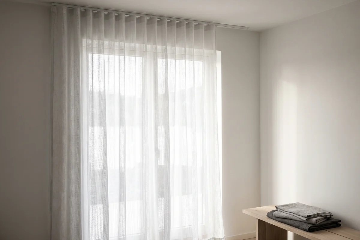
A sheer's colour is mostly the light coming through it. That sounds like a slogan; it is a practical warning. Hold a white sheer up to a bright midday window and it reads grey, because you are looking at fabric with daylight behind it rather than light bouncing off it. The same sheer at dusk reads warm and soft. People choose white sheers from a folded sample under downlights and are then surprised by both.
- Grey and charcoal. Cut glare and read as a soft screen rather than a bright panel. You see out better than you expect; the room is dimmer. That is the trade.
- Beige and oatmeal. Warm the light rather than filtering it. The safest choice against warm-white walls.
- Black. Sounds absurd until you have a dark-framed window, against which it simply disappears.
Whatever colour you pick, a sheer gives you nothing after dark — once the light is inside and the night is outside, the weave works in reverse, however dense it is. That is physics rather than a product gap, and the answer is to run sheer and blockout curtains together on a double track: the sheer does the day, the blockout does the night. Our sheer curtain range is built assuming exactly that.
Room by room
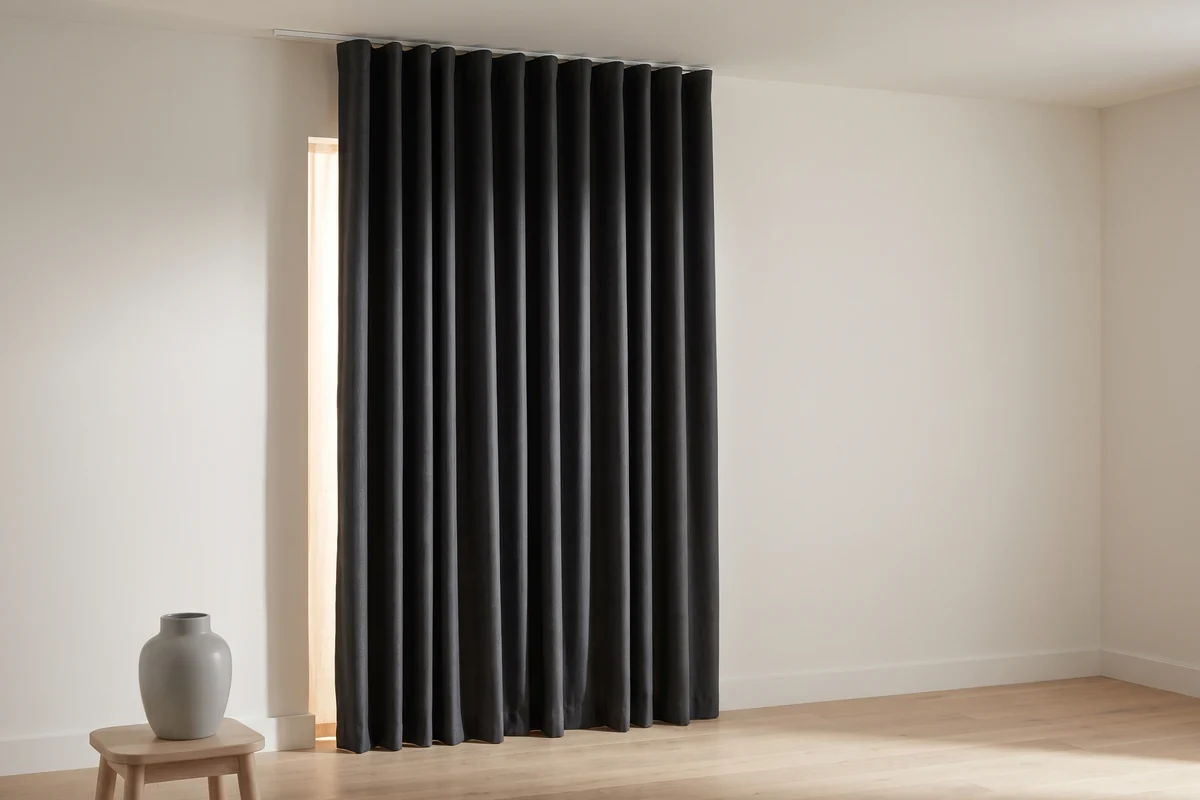
The room decides how much risk a colour carries. A living room is the one you will redecorate around for the next decade, so it wants the colour you will still tolerate when the sofa changes. A bedroom is the opposite: you mostly see those curtains closed and unlit, which is precisely why a bedroom is the safe place to spend a strong colour.
| Room | Colour that works | Why | Watch for |
|---|---|---|---|
| Living / open plan | Warm off-white to soft stone | Everything else in the room changes around it | Reads darker at fullness — go a shade lighter than you think |
| Bedroom | Anything, including deep colour | Mostly seen closed and unlit; blockout does the work | Dark colours plus a west window means fade |
| West-facing anything | Mid to pale, always lined | Lining takes the UV instead of the face fabric | Fade shows on the leading edge first |
| Kids' rooms | Mid-tone, washable | Hides marks; survives being pulled on | Specify cordless — cords are a genuine hazard |
| South-facing | Warm whites and creams | Puts back the warmth the light does not carry | Cool greys go flat and cold in here |
Of the bold colours, green has aged best — a deep olive or forest reads almost as a neutral in a way red and pink never quite manage. That is an opinion and it will cost me the occasional sale: a strong red curtain dates a room faster than almost anything else you can hang in it. If you want red, put it in a room with a door.
Not sure how a colour will read at your window?
We bring the samples to the room, at the hour you actually use it, and hold them up against your walls and floor. It is a great deal more useful than a showroom.
Blinds take the opposite approach
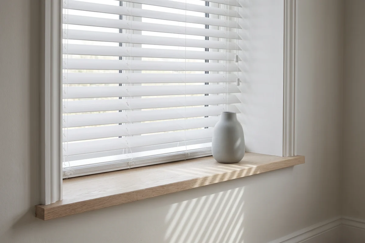
Curtains are furnishing. Blinds are closer to architecture, and the colour decision flips accordingly: most of the time you want the blind to disappear into the window rather than announce itself. That is why white and off-white outsell everything else in roller blinds by a distance, and why they are usually right.
Match a blind to the window trim, not the wall. A white venetian blind in a white-painted reveal reads as part of the joinery; the same blind in a colour reads as an object sitting in the opening. Timber and faux-timber venetians in white do the same job with more texture. And on a roller blind, how much you can see through the fabric will change the room more than its shade ever will.
Our shutter page makes the point more bluntly than I will: shutter articles argue endlessly about louvre colour, and colour is close to the least important decision on a shutter. Blade width and material decide whether you like it.
Frequently asked questions
Should curtains match the wall colour?
Match the undertone, not the colour. Curtains the exact same shade as the wall flatten a room and make the window disappear, while a curtain with the opposite undertone makes the paint look dirty. Aim for the same temperature two or three shades apart — a warm stone against a warm off-white wall.
Is it better to have light or dark curtains?
Light, for most rooms. Pale curtains bounce daylight back in, hide fade far better, and survive being read at fullness where a mid-tone often goes muddy. Dark curtains earn their place in bedrooms and media rooms, which are meant to feel enclosed and where the fabric is mostly seen closed.
Do coloured curtains fade in the Australian sun?
Yes, all of them, at different speeds. Ultraviolet light breaks the dye down, and it shows first along the leading edge and down the folds facing the glass rather than evenly across the curtain. Lining is the effective defence, because the lining takes the UV instead of the face fabric. Treat "fade-resistant" as a comparison, never a promise.
What colour curtains go with grey walls?
Grey walls are cool, so stay cool: chalk white, soft silver, deeper charcoal, or a muted blue-green. Cream and warm oatmeal against a cool grey wall is the classic mismatch and it makes both look wrong. If you are reading American advice on gray walls, the same rule applies — only the spelling changes.
Should every room have the same colour curtains?
From the street, effectively yes — the lining is what the outside sees, and keeping that consistent is what makes a house look considered. Inside, no. Each room has its own light and its own job, and a south-facing bedroom wants a warmer curtain than a north-facing living room in the same house.
What colour curtains make a room look bigger?
A colour close to the wall, hung high and wide, so the eye reads one continuous surface instead of a window punched into it. Colour does less work here than installation — taking the track to the ceiling and past the architrave changes the apparent size of a room far more than the shade you pick.
Sources Australian Government Your Home — Glazing · ACCC blinds and window fittings mandatory standard · Sleep Health Foundation
Back to the journalKeep reading
Related from the journal
 Guides
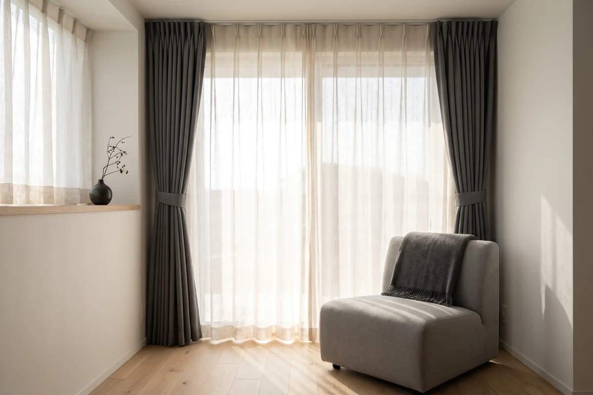
Sheer vs blockout curtains: which should you choose?
They solve different problems at different times of day. Run both on a double track and one window gives you four settings instead of one compromise.
Read more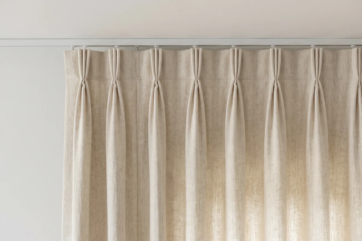 Guides
Pinch pleat vs pencil pleat vs S-fold curtains
The heading sets how the fabric falls and how the folds break the light — which is half of how a colour reads once it is hanging.
Read more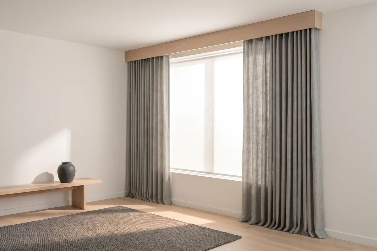 Guides
Do thermal curtains actually work?
What the lining actually contributes — the same lining that decides whether your colour survives a west-facing summer.
Read more